Quite often the turquoise is called blue or green. This is because it represents a fine line between the two colors. Although this color can be called independent, it has its own shades. There is dark and light turquoise and “color of the sea wave” (not to be confused with “navy blue”), correctly using them, you can achieve amazing results. Turquoise color has a unique property to fill the room with romantic grace as if it had adornments from turquoise itself. You feel as if surrounded by endless sea spaces or thickets of wild forests in such an interior. Below, we will try to explore which rooms is this color for and when it is the most relevant to use turquoise color interior decoration. The nautical theme for your home can be not only romantic and elegant but also functional and make you happy for a long period of time.
Contents:
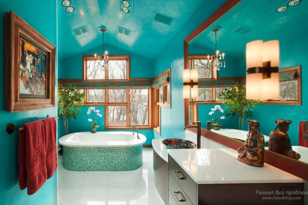
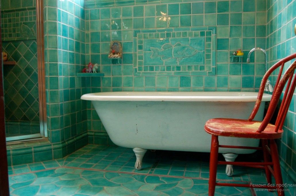
If you are not sure that turquoise color is a great idea for the interior, then try to decorate a bathroom in this color first.
The one feels itself like on the seabed. Turquoise color envelops with its uniqueness, softness, and grace.
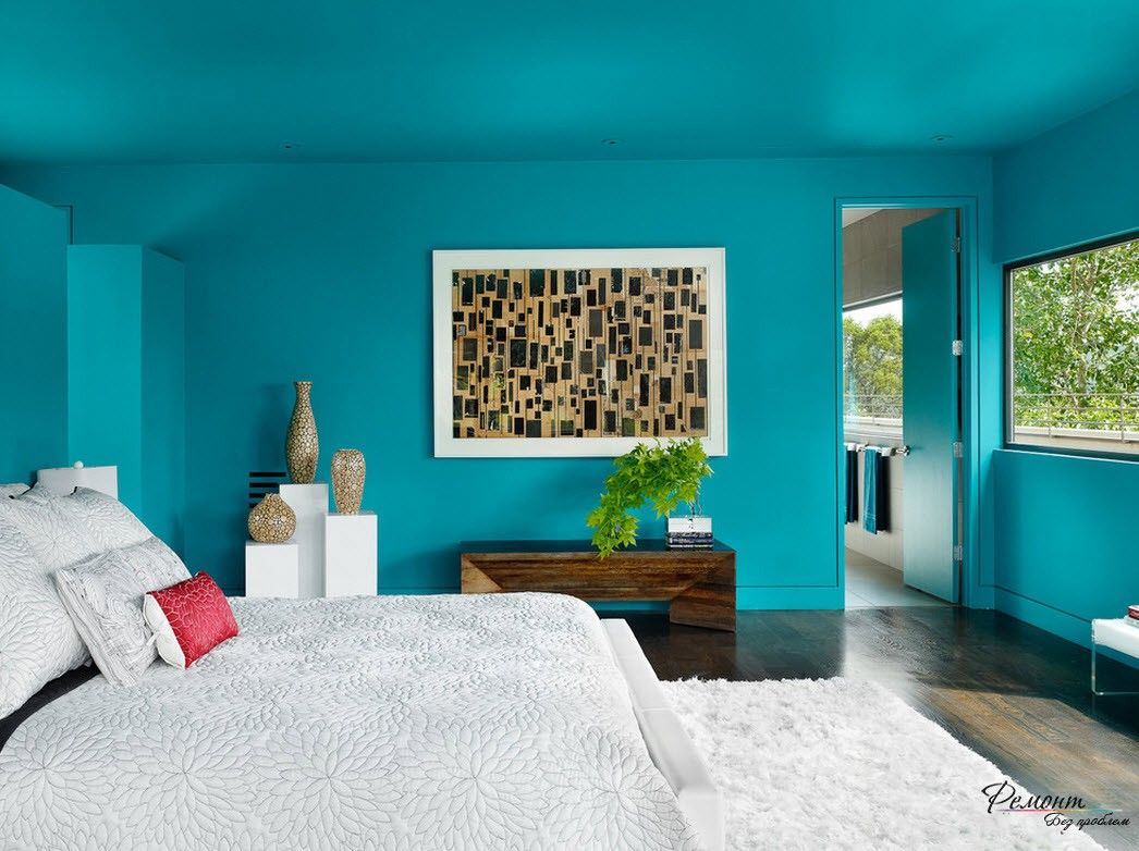
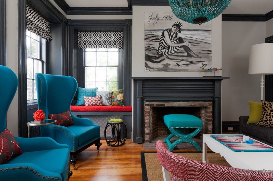
And if you are not afraid to experiment, bright colors are acceptable for your life – you can boldly use intensive turquoise in other rooms. You can just make a few accents with this color.
But do not forget that turquoise is a cold color. Accordingly, a lot of turquoise means a lot of colds. Therefore, if you are ready for this, you can boldly proceed to this design of the room. And if you want to use a drawing, for example, on the wallpaper, furniture, or a picture with a flower on a turquoise background then the effect will be opposite. That means you’ll get a softer and not-so-cold tone.
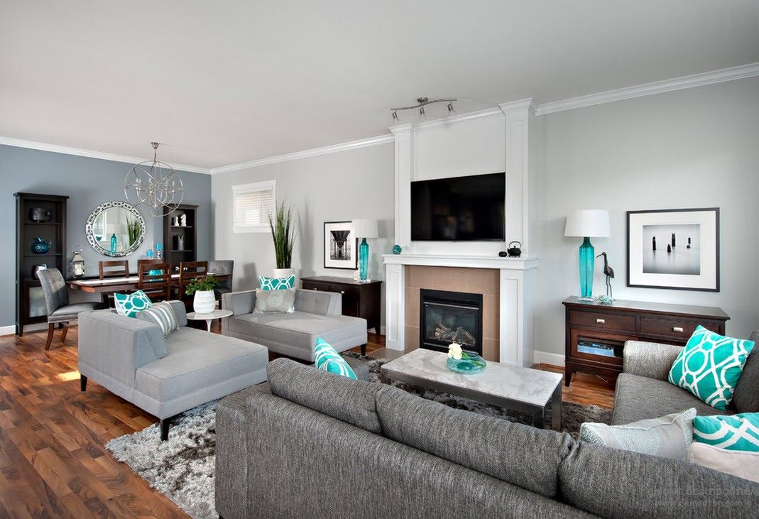
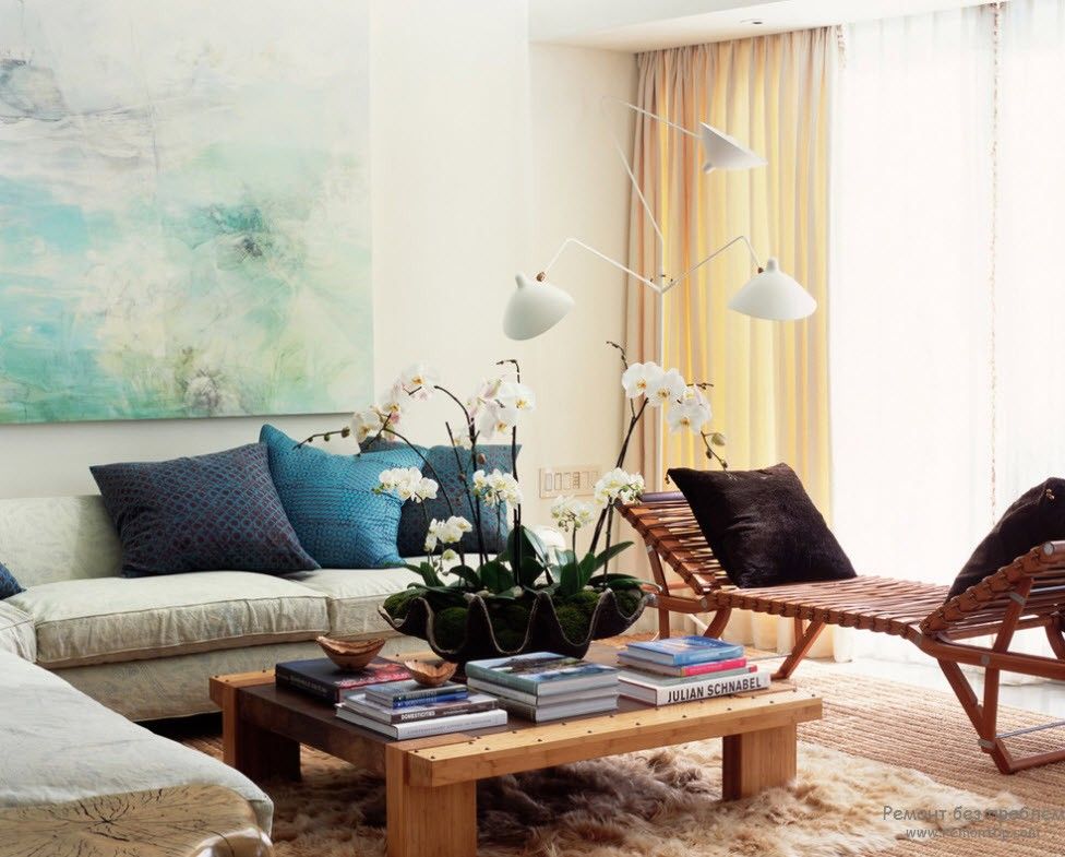
By the way, it’s important to remember that combining bright turquoise is better with more tranquil shades, otherwise, the whole effect of turquoise coloring will be lost, and the room will be too variegated.
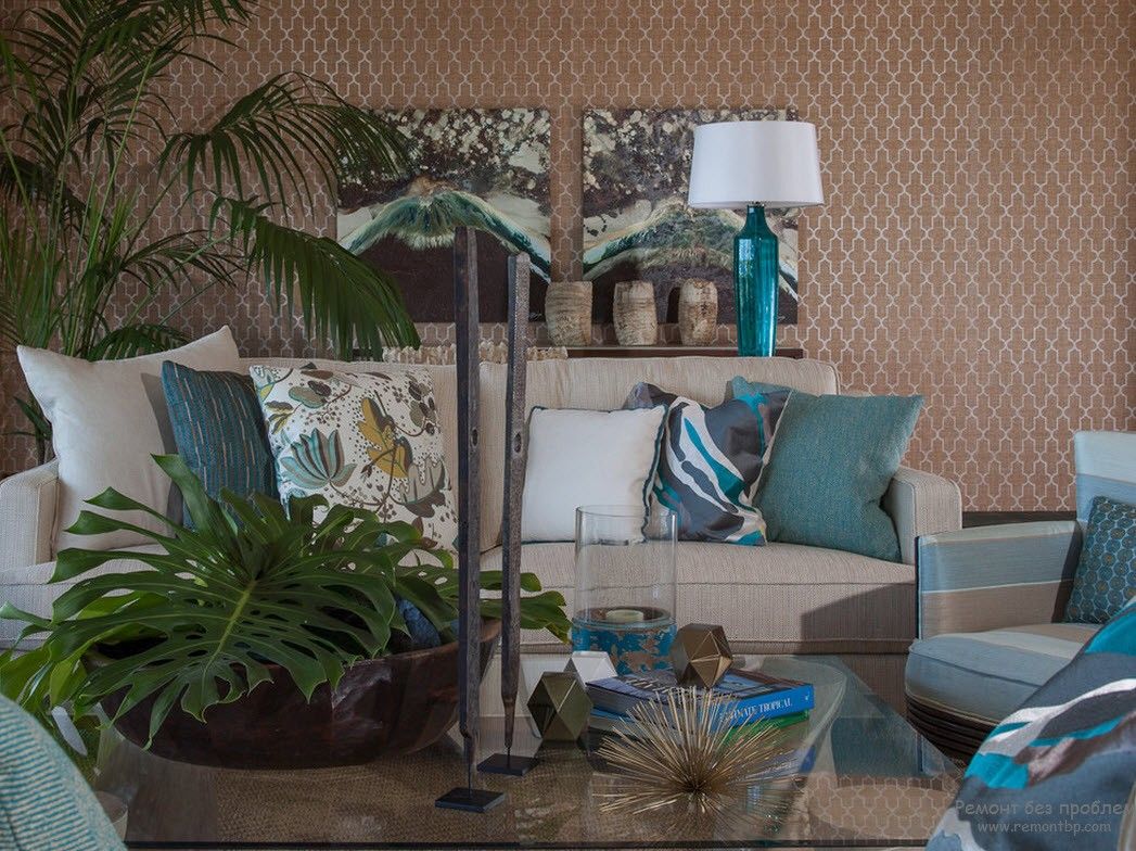
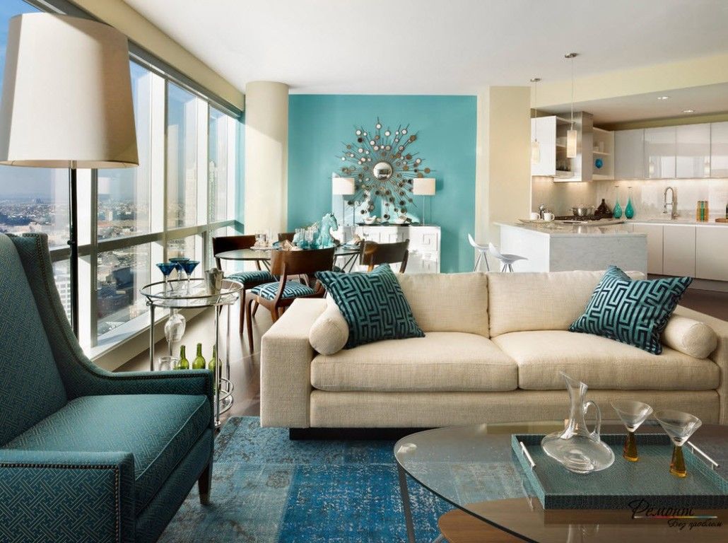
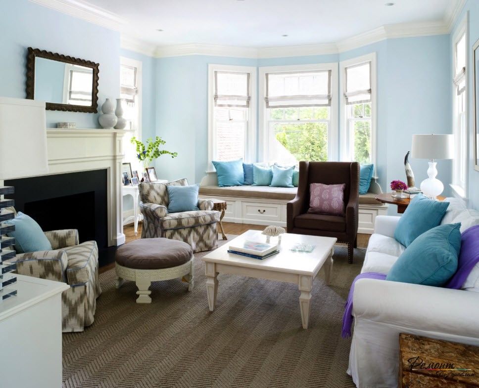
The ideal fit for turquoise motifs are pastel colors, they add airiness and serenity to its light coolness. Such interiors are perfect for dreamy natures with a calm character. They advise using turquoise color in a moderate amount in such interiors. For example, apply it on one wall and several accenting objects. And beige color can be used for furniture, some parts of walls and other details. Here we can see the point distribution of roles. It sets the mood for the room since the chaotic mixing of colors is more appropriate if they are close in tone. But with a combination of bright and calm colors, it is better to separate them from each other. Otherwise, one of them will be lost.
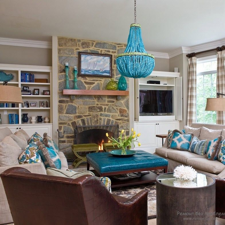
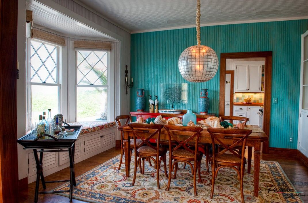
Since the turquoise color embodies nature, you can supplement it with wood both as color and as material. This interior will be the coziest and homey. Here you’ll want to spend as much time as possible. The atmosphere of the dining room, designed in this way, will adjust to a sincere conversation.
The color of wood or straw, combined with turquoise, can make the interior more energetic and visually increase the size of the room. It all depends on the filing and décor. In addition, the wooden materials in this union will soften the cool turquoise color and the interior will become warmer.
But despite all the advantages of turquoise color, it is rarely to be found as an interior decoration. What caused this injustice to this color is unclear. After all, if someone does not like its excessive brightness, he or she should know that turquoise, like many others, has more muted shades, for example, a blurred turquoise. This shade is widely used in Western interiors due to the fact that it is not so cold and not too active. This color is calm. It helps to reduce the intensity of the setting sun.
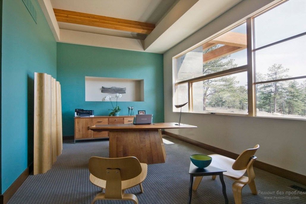
Blurred turquoise is well suited for a children’s room, bedroom, and even a study. In relation to the children’s room, bright accents or combinations with another more saturated tone will also fit the softness of the blurred turquoise. This combination will also suit the home office as it does not cause drowsiness and does not distract from work (as red, orange, blue, and green). Such combinations will make the room fun, but not pressing on the psyche.
As for the bedroom, preference is given to a calm range of colors here, as always, since it is most suitable for good sleep and rest. Therefore, the use of blurred turquoise is the best fit here in combination with bed colors.
There are a lot of nuances and opportunities to properly play around with any color. To use it as the main or in the form of an accent, rich or soft, combine with bright or neutral colors – all this depends on the desired result and the value that is given to the room. The main thing is to do everything with a particle of your soul and inspiration.
Investing in high-end ranges may significantly impact your property's value. In addition to improving the…
Dealing with a non-responsive thermostat can be a frustrating experience for homeowners, impacting both comfort…
A mini-split heat pump is a low-maintenance heating and cooling system that is very efficient…
Are you thinking about installing a Murphy bed in your home? If yes and you're…
Are you thinking about turning to solar power for your home? Sound familiar? You may…
Electrical issues are one of the most frustrating problems you could ever experience. They can…
This website uses cookies.