Once the structural frame of your home is complete, the next item on your bucket list should be to make it look as attractive as possible. So, on top of painting the walls in neutral or bold hues and hanging incessant curtains, you’d want to display several art prints to fortify the interior looks. But you must approach it professionally, lest you end up with inelegant walls.
Here are five pro tips to using art prints in your home:
Go for Museum-Quality
Nothing spoils the day like a shoddily done art piece on the walls of a stylish home. So, when choosing your art prints, insist on museum quality. One way to ensure that all your purchases are first-rate is by sticking to a reputable supplier, such as Fine Art America or other similar ones.
This way, you can rest assured that the art prints you hang on your walls won’t weaken your fashion sense but rather amplify it. Moreover, high-quality art pieces will most definitely last you a lifetime. Thus, you won’t have to keep buying them over and over again.
Choose the Right Size
As you’re probably aware, large art prints are one of the latest trends globally. Indeed, many designers are abandoning several small paintings for one large-scale art piece. They rightly claim that such large artworks have a more significant visual impact than smaller ones.
Furthermore, big art is seen as a refreshing option for those who treasure simplicity. If you’re one of these people, make a point of purchasing large art prints with widths starting from 30 or so inches.
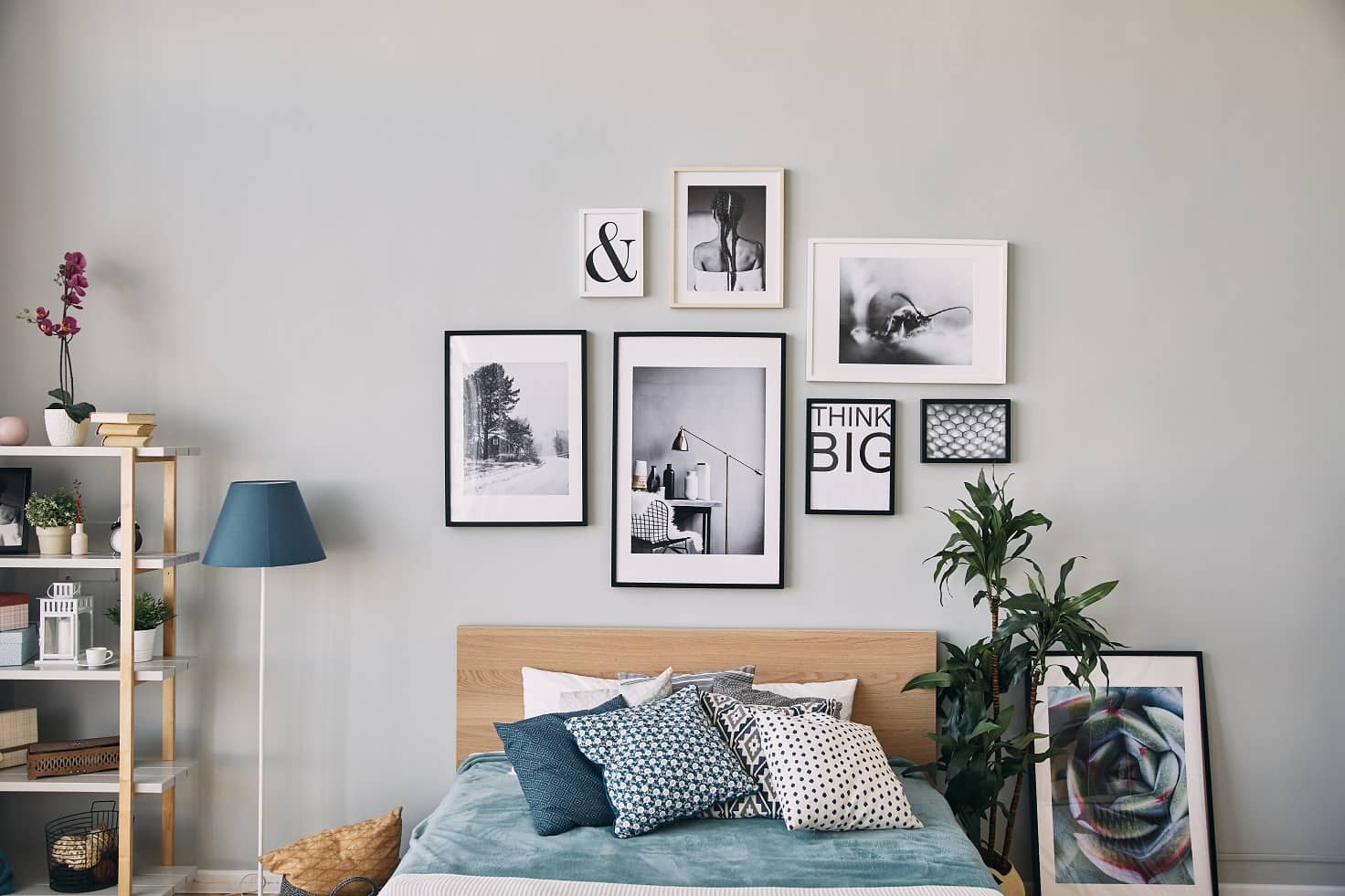
Hang Them in Odds
Instead of one big piece, you can still hang a couple of smaller ones side by side. For instance, if you want to fill the wall above your five-seater sofa set with art prints, getting a large-sized print may prove challenging. So, your next option is to hang several pieces next to each other.
When doing so, you’d want to follow the rule of odds, which states that items organized in odd numbers are more attractive and memorable than those grouped in even numbers. It all boils down to how the human brain forms distinguishable patterns. So, you’d want to hang three art pieces behind your big couch rather than two or four. If space allows, consider hanging five, seven, or nine.
Space Them Appropriately
Space is one of the seven elements of art. You can look at space as the distance or areas around, between, and within the different components in a particular art piece. According to one famous American architect, space is the breath of art. In other words, without it, art is dead, especially since it gives the onlooker a reference for interpreting an artwork.
With that said, you’d want to space your art pieces appropriately, in addition to the spaces left within the image by the artist. Here are three conventional art-related spaces you must be aware of:
- 3” to 6”: The optimal space between pieces of art
- 6” to 8”: The optimal space between the top edge of furniture and the bottom edge of art
- 57” to 60”: The optimal height for wall art
Spacing art prints this way ensures that they don’t look too crowded. But still, don’t leave too much space, as the individual frames may lose their relationship with each other.
Stick to a Single Theme
If you mix family portraits with landscapes, pop art, natural scenery, and the rest, you’ll confuse the onlooker’s mind, and they might not appreciate the pieces as you’d intended. The best approach is to pick just one theme and stick to it.
For instance, if you like natural scenery, make a point of hanging pictures of mountains, rivers, forests, waterfalls, deserts, and suchlike views, without mixing them with other styles of art.
Here are other themes you can choose:
- Abstract
- Baroque
- Cubism
- Dadaism
- Futurism
- Impressionism
- Minimalism
- Pop art
- Symbolism
- Biophilic
- Performance art
Match Them to Your Home Decor
You wouldn’t want an art piece that clashes with the rest of your home decor. It’s best to purchase those that fit in the color pallet for your home’s interior design. A typical color palette may include hues like sienna, dark khaki, black, silver, and dim gray or tan, pink, dark olive green, light steel blue, and gray.
When choosing your art prints, confirm that their dominant color is part of your color palette. This is to ensure the wall art blends perfectly with the rest of the home decor. If you choose a clashing color, it might be too much on the eyes, and the viewers might leave with a bad taste in their mouth.
Conclusion
You now have an idea of how to use art prints in your home. Aside from this handful of tips, make a point of applying your creativity, as that’s what art is all about. Even if you miss a step or two, there’s always room for correction, and you’ll appreciate the entire process. And if you’re not wired for such, you can always consult an interior designer to help you decorate your home using art prints.