Color is everywhere. We see hundreds of millions of hues daily. Have you ever thought about how color affects your behavior, mood, health, and even decision-making? Since ancient times, humans have used the effect of color in medicine, politics, architecture, design. By studying color psychology in interior design, you can get to know how to use colors for your own profit.
Contents:
Seeing a product or environment, your subconscious mind estimates them within the first few seconds. This estimation is near 80% based solely on color. By the way, 52% of buyers don’t come back to the store again if they did not like the design because of their aesthetic standpoint. Maybe, it’s okay, when it’s in a shop, although these percentages should make business owners think. But if you hate colors at work or at home, then it’s trouble! That’s why it is so important to make the right choice of “your” color palette.
Color Psychology in Interior Design in more Detail
Colors for the interior can affect the atmosphere that will be in a room: well-being, working capacity, mood, and so on, largely depends on the color. Different colors send different signals to the brain. So they can have a specific effect on both the physical and emotional levels. Moreover, you feel both positive and negative looking the same color. Of course, each person has his/her individual perception of color based on life experience, cultural and national characteristics. But basically, our subconscious mind reacts to colors the same way.
Choosing a color for the interior is worth considering the temperament and character of the people who will be in a room, as well as the room’s functional purpose. For example, if you are very energetic, active, emotional, it would be better to choose a calmer color scheme for your apartment. If you are a closed person, you should stir yourself up with more vivid colors. This will give a balance. As for the purpose of the premises, it is better to make a kitchen, a living room, a dining room brighter and warmer. At the same time, it is worth giving preference to muted, calm shades in rooms for rest and relaxation. And now let’s review more detail.
White Color
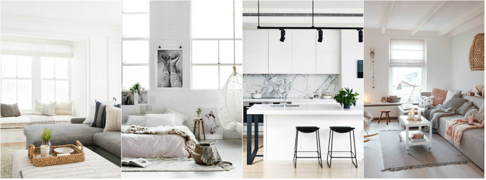
White is the color of purity, innocence, freshness, lightness. It visually expands the room, makes it more spacious and lighter. Therefore, if you have a small space, white is a great option. However, if you add too much this color, the interior may seem cold, lifeless, and sterile. To avoid such an effect, it is worth diluting the white interior with wooden elements and a few additional colors. It is better if these elements are warm shades of wood. In such an interior you can feel more harmonious, relieving any tension, just relaxed and put your thoughts in order. At the same time, the white color fills with energy.
Gray Color
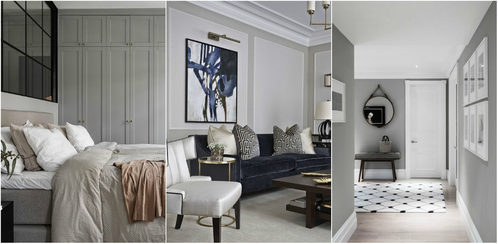
Gray is the color of knowledge and wisdom. As well as white, it is a neutral color, but if white is simple, then gray is refined and sophisticated. Due to its restraint, this color will create an atmosphere of calm and stability. A combination of dark shades of wood and gray color looks “more expensive”. Its combination with light wooden furniture – fresher and easier. Also, it is worth remembering that gray can look conservative and boring, cause a depressed mood. It should be great to add additional colors to the gray interior.
Black Color
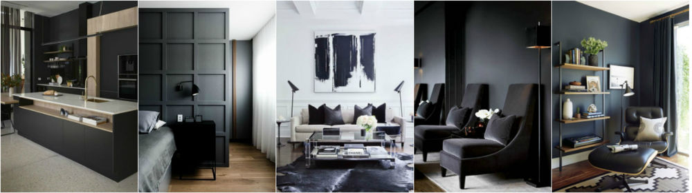
Black is the color of strength and luxury, power, emptiness, and mourning. This color always causes strong emotions. So it can be very overwhelming. With proper use, black will add nobleness, respectability, chic, and elegance to the interior. It blends perfectly with mirror surfaces and can hide imperfections. However, overdoing the black color can visually compress the room, darkens it, creating a crushing impression. The abundance of black can negatively affect the human psyche, provoke melancholy and depression. Black must be used sparingly, in strokes and details. This color is perfect for a study, bedroom, and even a living room. Though you should avoid it in the children’s room.
Green Color
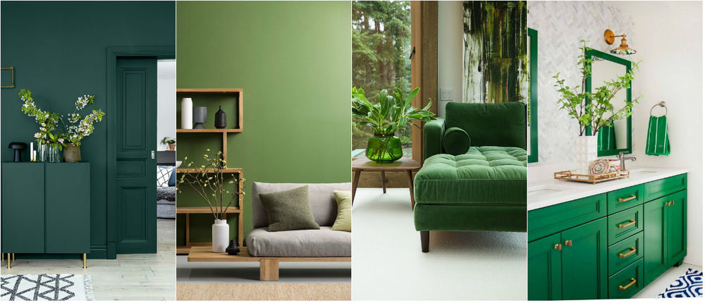
Green is the color of harmony, nature, freshness, and wealth. This is one of the most common colors in nature and the only one that we perceive without distortion. The most famous symbol of green color is a tree. An evergreen tree is associated with vitality. At the same time, the image of a tree exists in almost all religions, both modern and ancient. A plant as a laurel is considered a symbol of eternal life. Not surprisingly, people are always happy to see the first green grass in the spring.
Green affects positively on the body. You will faster feel mental and physical relaxation and soothing in a green room. So it is just perfect for bedrooms and children’s rooms. In addition, the green color helps to concentrate. That’s why it is so often used in the design of workrooms. You can put more home plants in your office to make an inspiring atmosphere. Green color will fit well into the interior of any room due to its versatility: its brighter shade will invigorate. Its muted hue will calm and it is unlikely to ever bore or annoy you.
Blue and Light Blue
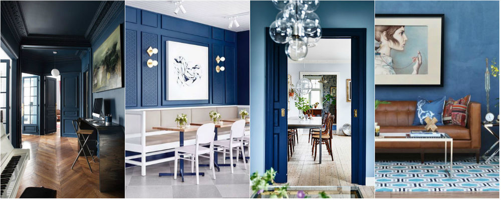
Blue is the color of trust, intuition, honesty, and kindness. This color is a favorite for most people. In the interior, blue helps to clarify thoughts, to calm, suppress aggression, relieve stress, improve concentration and stimulate working capacity. In addition, the blue color lowers blood pressure and heart rate, helps with insomnia, and dulls appetite. Nevertheless, if you add too much navy blue color to a room, it can suppress just like black.
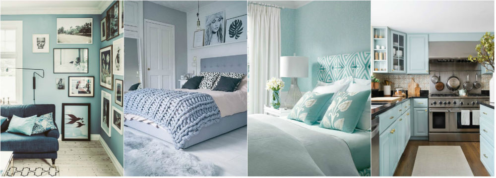
Light blue has similar characteristics but in a lightweight version. This color is more fresh and airy. Like white, it is able to visually expand the space, create a feeling of coolness. It well suits a children’s room, a bedroom or a study. If you keep on a diet, it will be the perfect choice for a kitchen. Also, blue and light blue shades are an excellent solution for hot sunny rooms, the windows of which mainly face the south side. The room will seem cooler. When psychologists made an experiment, they found out that people felt cooler in a blue room than in a red one. The difference in temperature was 55,4 °F according to people. It goes without saying that the blue color is inappropriate for rooms facing the north side.
Red Color
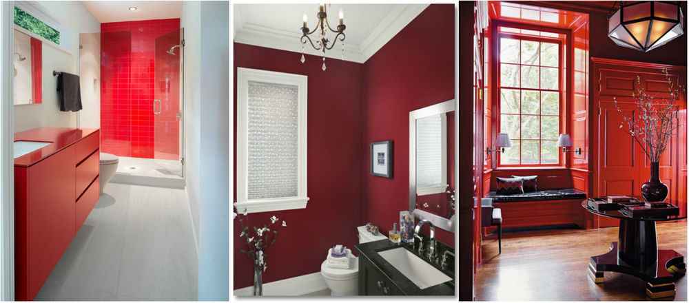
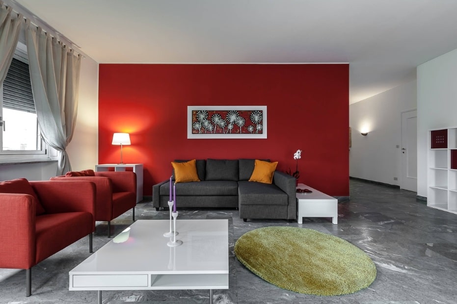
Red is the color of passion, love, power, wealth, energy, success, and anger. It is a very spectacular color. This color attracts more attention even there are other bright colors in a room. Thereby warning signs, inscriptions are always made in red. The influence of this color like others varies depending on its intensity. Bright red affects more than muted. According to color psychology, red invigorates, fills with energy, encourages action, gives confidence, and brings positive emotions. In addition, this color speeds up the heartbeat improve blood circulation, and increases blood pressure. An excess of red can cause anxiety, irritation, and fatigue. In the interior, the red color narrows the space. So you should use it as an accent in small apartments. Such rooms as the kitchen, hall, living room look wonderful and at the same time comfortable in bring red shades.
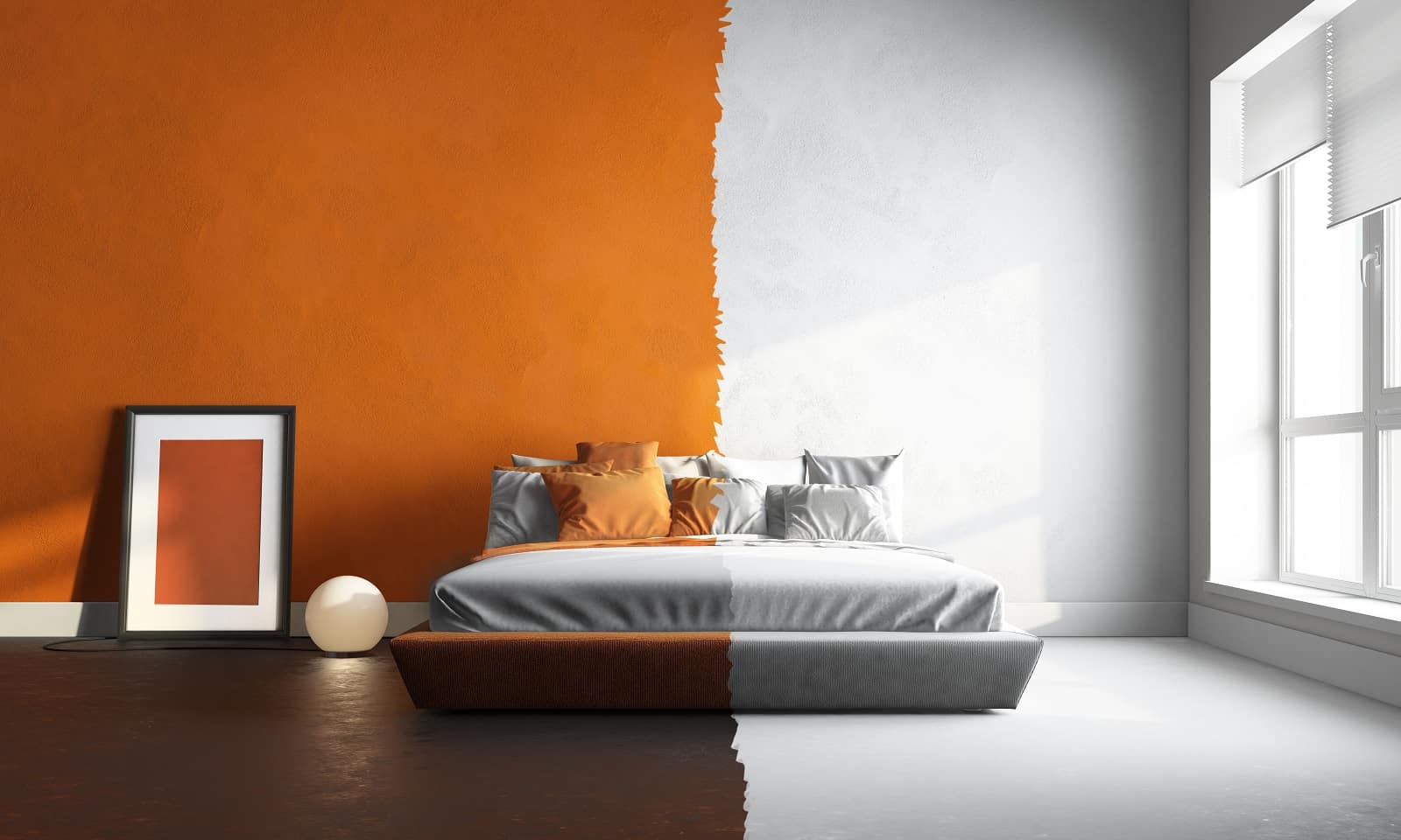
Orange Color
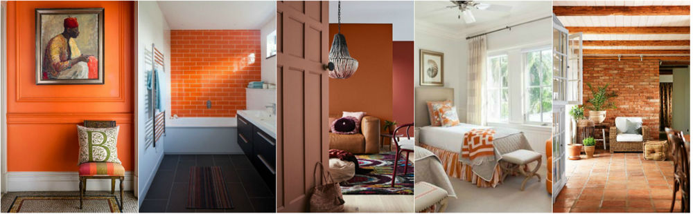
Compared to others, orange is a very ambiguous color. It causes the opposite emotions in people more than any other color. So it is either adored or simply can’t stand, although this color is one of the most positive. Orange is the color of joy, energy, vitality, warmth, and oranges. Also, this color is stimulating like red. Thereby, it inspires communication, stimulates mental activity, and stimulates appetite. Orange is often associated with the cozy flame of a home fireplace. This color is ideal for decorating such areas as a living room, a dining room, a kitchen, a games room. However, an excess of orange can quickly get tired, so use it gently.
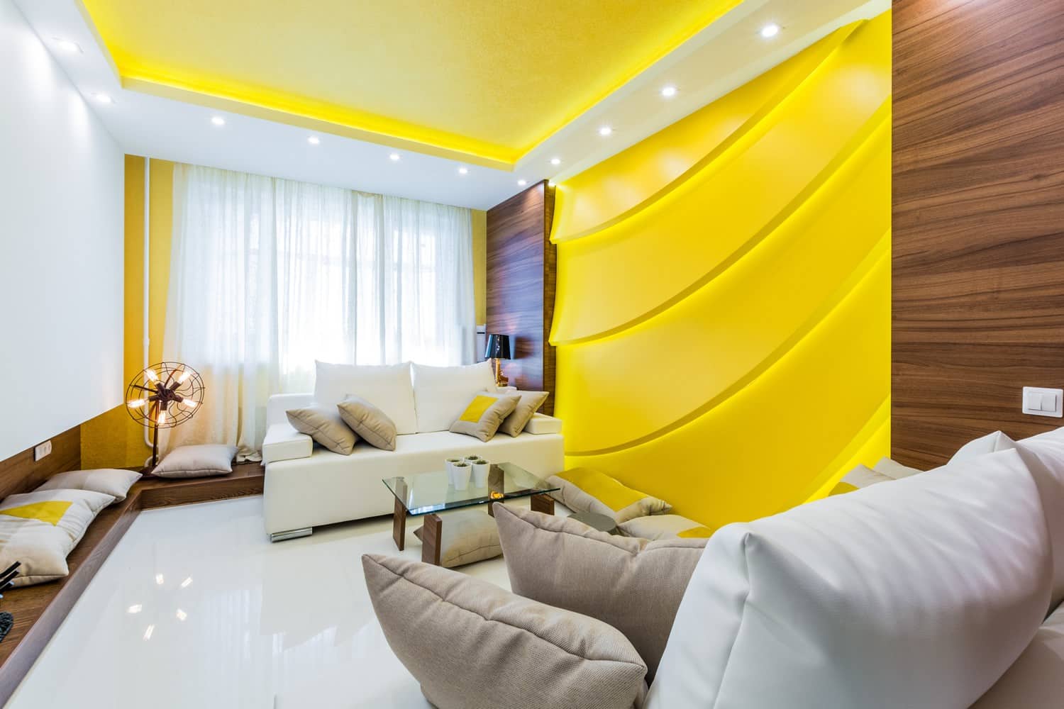
Yellow Color
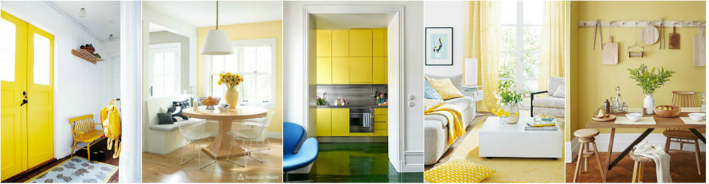
Yellow is the color of sunshine, joy, wealth, fertility. It brings a good mood, energy, desire to communicate, and a positive effect on the nervous system. The warm yellow color positively affects the digestive system and enhances appetite. In addition, yellow stimulates brain activity and creativity; helps with concentration and memory. That’s why this color is very good for designing a work area. Yellow color expresses the main need of people – to be happy. In spite of this, a person with many fears will never choose yellow.
However, you shouldn’t use bright yellow in very small children’s rooms. Yellow can negatively affect the baby’s nervous system, and then the kid will constantly be capricious and cry. Despite many positive properties if there are a lot of very bright and saturated shades of yellow in a room, it can make you feel tired quickly. The yellow color is ideal for decorating rooms facing the north side. Therefore it perfectly compensates for the lack of sun.
Violet (Lilac) Color
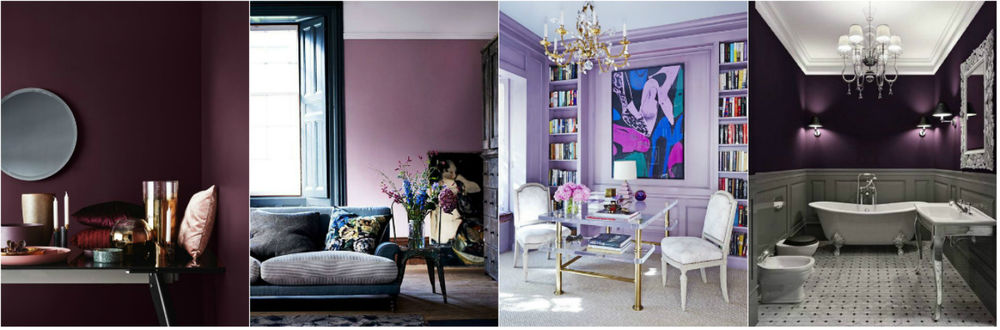
Violet is the color of mysticism, wisdom, artistry, inspiration, the color of the royal family. This color is usually liked by creative and eccentric people. Violet is a very controversial color. For example, very emotional and sensitive people or who has an alcohol addiction or mental illness should not be surrounded by this color. It’s very difficult to perceive it for them. Intense and deep purple brings richness and luxury to the interior; berry, reddish-violet shades look great.
However, if you use the wrong shade of purple, especially bright, the interior will look cheap and tasteless. Dark purple should be used in a metered way, as an accent, since its abundance can be depressing. Whereas light, lavender, almost whitened shade is quite suitable for background interior decoration. Violet encourages, gives self-confidence. Also, it balances thoughts and the nervous system, stimulates creativity, observation, helps with insomnia, and reduces pain.
Pink Color
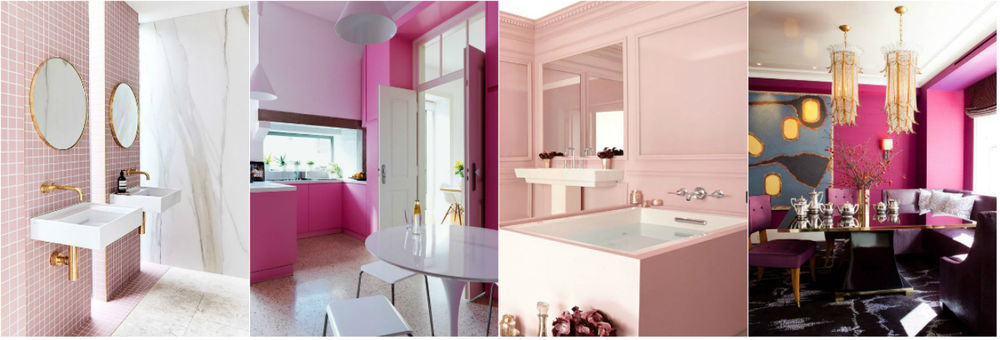
Pink is the color of femininity, tenderness, romance, and dreaminess. Proper use of this color can bring softness and lightness to the interior. You should avoid using too bright variations of pink in the interior such as fuchsia. Firstly, these hues look cheap and childish. Secondly, their excess will look cloying and annoying. If you want the interior to look more expensive and more elegant, you should use dusty, smoky tones of this color. If you want to bring freshness and lightness, you should choose light, whitened shades.
The psychological effect of pink is soothing, reducing aggression, relaxing, and relieving nervous tension. Pink affects positively the nervous system, on the organs of hearing and vision, it enhances immunity. Light tints of pink can reduce pressure, vice versa, bright ones increase it. Without any doubt, pink color is more often used in the design of children’s rooms for girls, but it is also great for bedrooms, living rooms, dining rooms. You shouldn’t surround yourself with this color if you are too sentimental or sensitive, as pink will only enhance these features. On the contrary, this color will help girls and women who want to develop femininity, tenderness, soften some harsh aspects of their character.
Brown Color
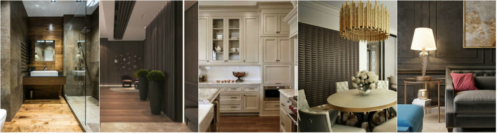
Brown is the color of the Earth and nature, traditions, and stability. This color is very well perceived, it creates a feeling of comfort and safety. In particular, self-sufficient, confident people prefer brown-colored interior design. At the same time, people who are searching for their path or just loving changes prefer to avoid it. This color helps to balance, find peace, and to make thoughtful decisions. Especially a deep dark shade of brown is very effective in the interior. Though its excess can provoke depression and boredom. But light neutral shades are appropriate in any proportion. The combination of brown with natural wood will bring nobleness, warmth, and comfort to the interior. This color is perfect for any room. Feel free to use various shades of brown in the interior of the kitchen, living room, bedroom, study, and even the nursery.
Final Words
We didn’t mention a bathroom as this zone is universal in terms of color choice. It is impossible to say which color looks better in a bathroom. The design depends on your personal preferences and feelings. For example, bright shades of orange, yellow or red will cheer up you in the morning in a bathroom. It should preferably be in combination with some neutral colors. If the process of washing a body is associated with the sea and freshness, it will be better to choose blue and green shades. But in such interiors, the air temperature seems several degrees lower than it actually is. In that case, the combination of natural shades of brown and white or even black will be a great idea that will create a warm and comfortable atmosphere.
Trust your feelings and sensations when making repairs in your apartment. Feel free to do something bold in spite of the rules!
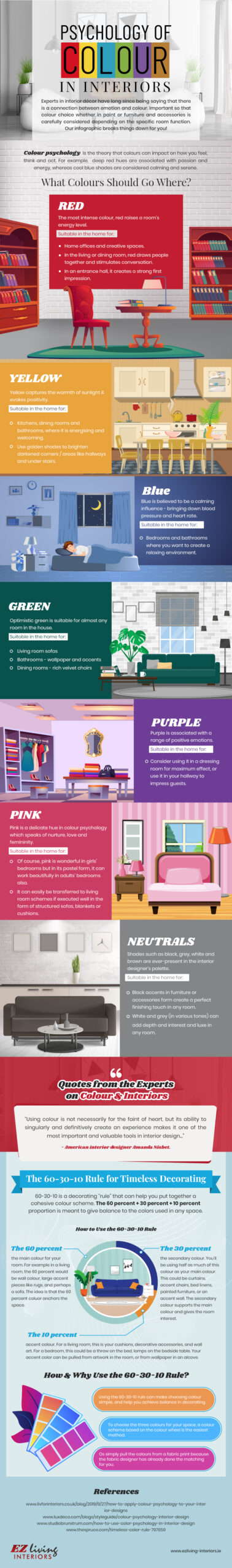
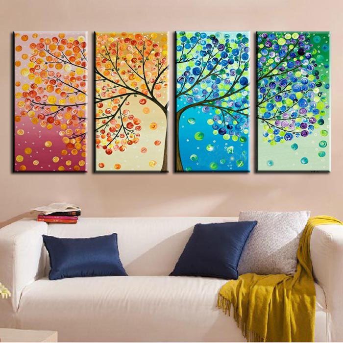
Bonus: infographics showing visually the use of color in interior design and its effect on people’s condition from great EZLiving team.